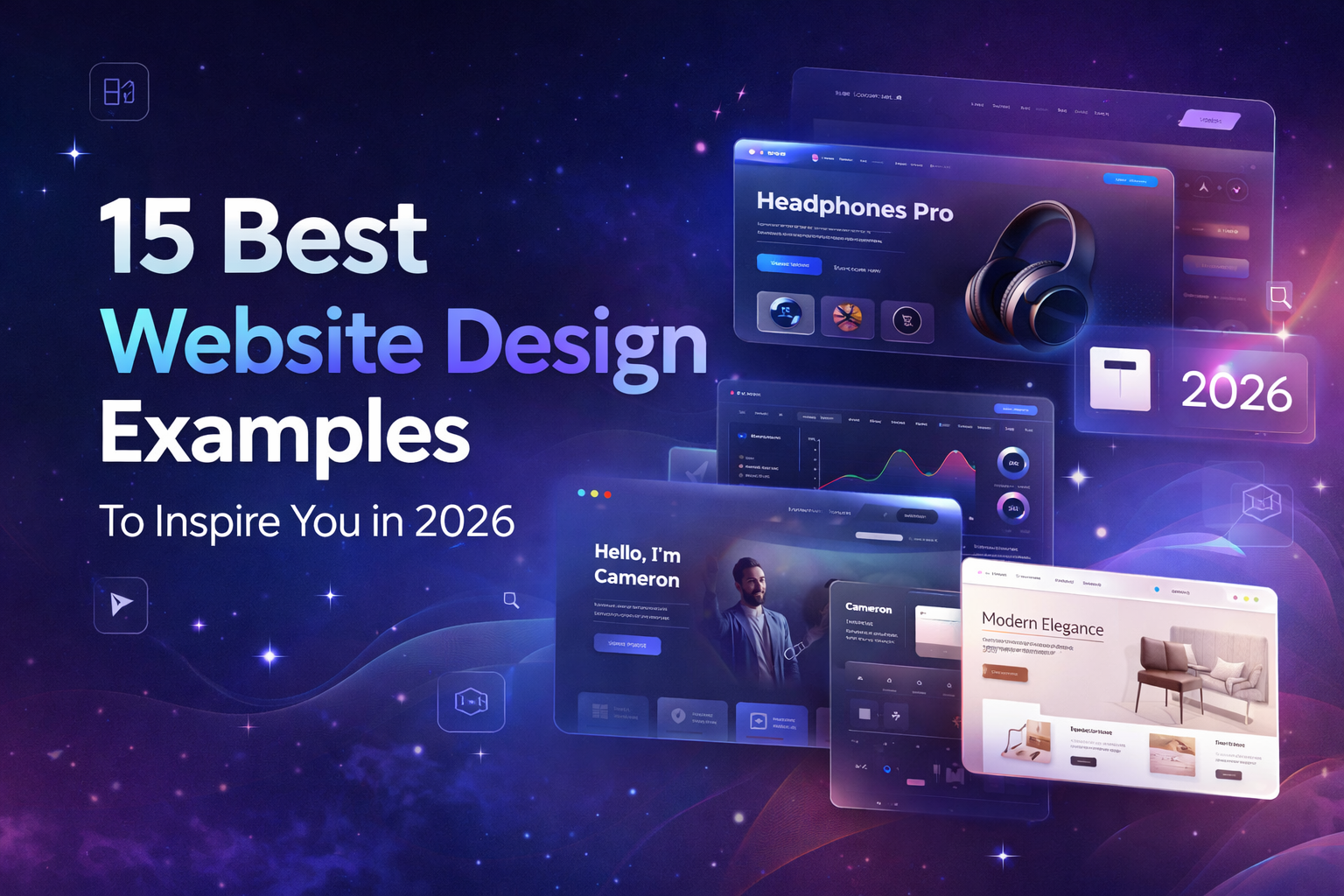
15 Best Website Design Examples to Inspire You in 2026
Most visitors decide within seconds whether a website is worth exploring. If the layout feels confusing or the message isn’t clear, they leave. Good website design solves that problem by making information easy to understand and navigation effortless.
Studying great websites is one of the fastest ways to see what works. The best designs combine clear structure, strong visuals, and smooth user experience to guide visitors naturally through the page.
In this guide, we’ve selected 15 website design examples that stand out in 2026. Each one shows how thoughtful design can turn a simple website into a more engaging and effective digital experience.
What Makes a Great Website Design?
A great website doesn’t just exist online; it works quietly but powerfully. It guides your visitors without confusion, answers questions before they’re even asked, and makes decisions feel natural.
When your copy, design, and UX all line up, your website stops being just a page and starts being your clearest explainer, your strongest reassurance, and your most persuasive salesperson.
User-Focused Navigation
Think about Stripe. Every menu, chart, and button is designed around what users want, not the company’s org chart.
Keep top menus short, use labels people actually search for, and make it easy for someone to know exactly where they are.
Little touches like side navigation or jump links?
They might seem small, but they keep people moving without frustration.
Clean Layout and White Space
White space isn’t empty; it’s breathing room. Look at Medium’s pages. Clean margins, smart padding, and a thoughtful grid give your eyes a place to rest and your brain a chance to focus.
The result?
Users can scan, read, and act without feeling overwhelmed. It makes your site feel professional and effortless, no matter the device.
Strong Typography and Branding
Fonts aren’t just letters; they’re personality. Take Vantage Spaces: bold headlines, readable body text, consistent style. Typography tells users who you are before they even read a word.
It guides attention, creates hierarchy, and makes your brand instantly recognizable. Even small adjustments in spacing or weight can change how confident or approachable your site feels.
Interactive Elements and Animations
Motion, when done right, feels alive. Buttons that respond, subtle hover effects, and smooth transitions all make users feel in control. Prioritize the interactions that matter most and keep them consistent. Done poorly, motion distracts. Done well, it delights.
Mobile-First and Responsive Design
Start small. Mobile-first means designing for touch, space, and speed first, then scaling up. Large buttons, fluid grids, fast-loading images, it’s all about making sure your site feels natural on any device. If it works on a phone, it works everywhere.
The best websites do more than look pretty; they guide, reassure, and persuade. They shorten sales cycles, make conversations easier, and make visitors feel like they’re already in the right place. Done right, your website isn’t just online, it’s working for you, quietly, every day.
15 Best Website Design Examples to Inspire You
A great website doesn't just look good; it makes things easy for visitors. Clear layouts, strong visuals, and smooth interactions help people understand your message and explore your site without confusion.
In this list, I've picked 15 website design examples that stand out for their creativity and simplicity. Each one shows how thoughtful design can improve a website's user experience.
1. Jeton
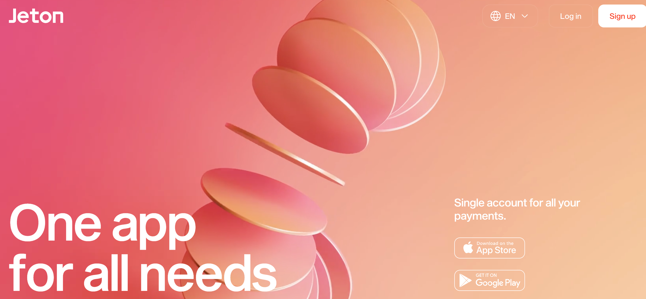
Jeton’s website is a good example of how fintech brands balance clarity with polish. The layout feels clean and structured, which helps visitors understand the product quickly.
Large headings, clear calls-to-action, and subtle motion guide the eye without overwhelming the page.
Instead of trying to impress with complexity, the design focuses on making financial services feel simple and trustworthy.
Our Opinion: A great choice for fintech brands looking for clarity and trustworthiness. We recommend this simple yet polished design for clients in the financial sector.
2. Phamily Pharma
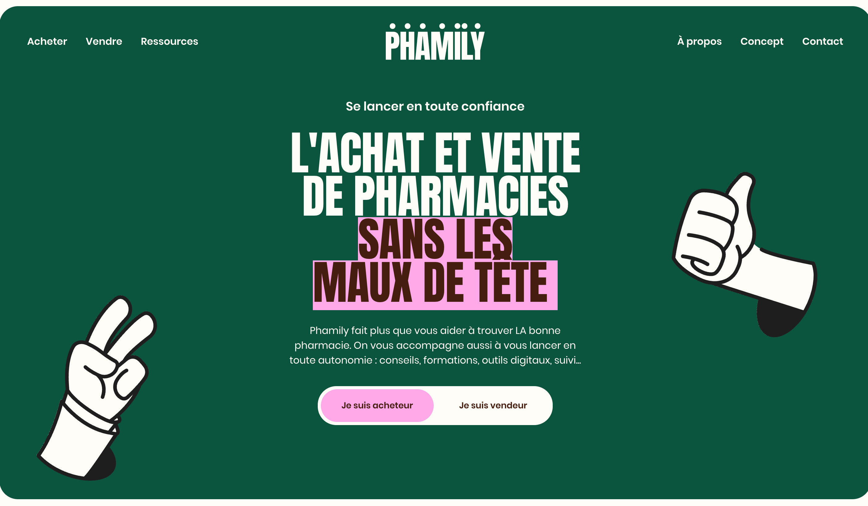
Phamily Pharma shows how healthcare platforms can present complex information without feeling heavy. The design uses structured content blocks, calm color choices, and plenty of space between elements.
This makes the site easy to navigate even when explaining detailed medical or product information. The result is a professional experience that builds confidence while keeping users focused.
Our Opinion: Perfect for healthcare sites or any platform with complex content. This design builds trust while keeping things accessible.
3. Osmo Supply
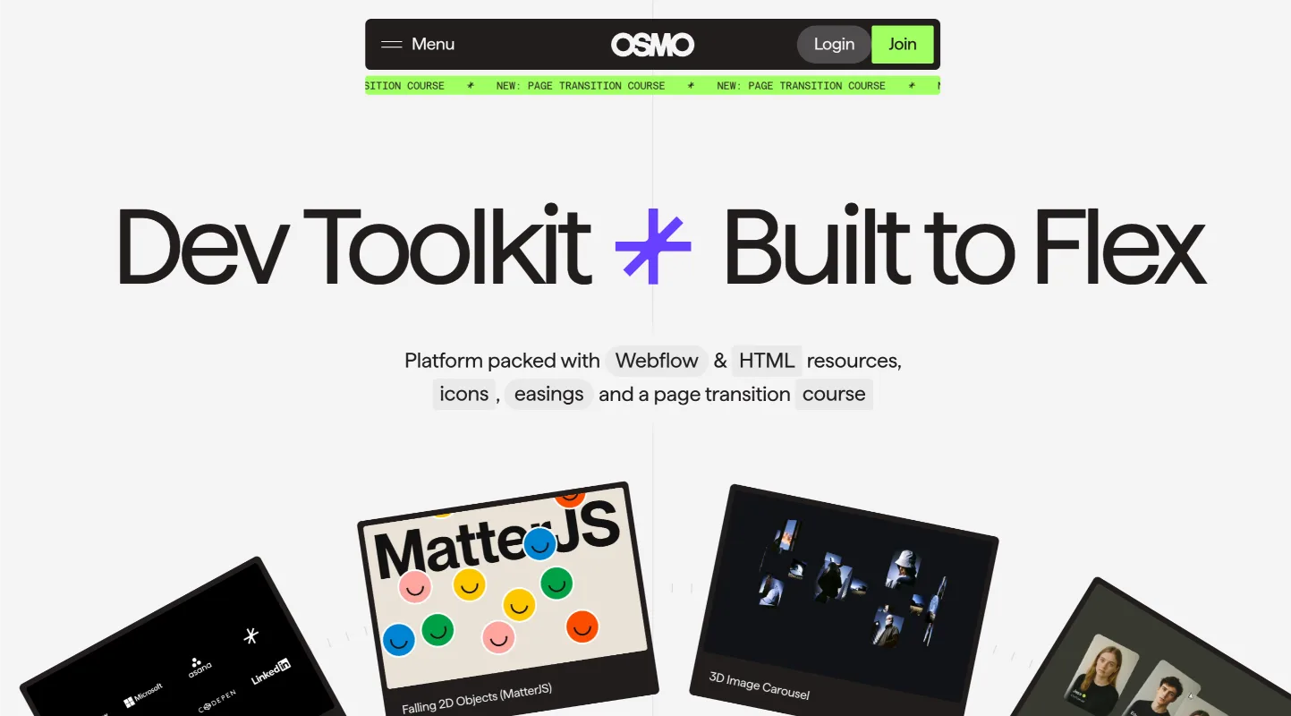
Osmo Supply leans heavily into visual storytelling. Product imagery takes center stage, supported by minimal text and clean sections that keep the experience smooth. Scrolling feels natural, and each section introduces the brand step by step.
It’s a reminder that sometimes the best design decision is simply letting the product speak for itself.
Our Opinion: Ideal for e-commerce sites where the product is the star. Simple, engaging, and effective.
4. Gufram
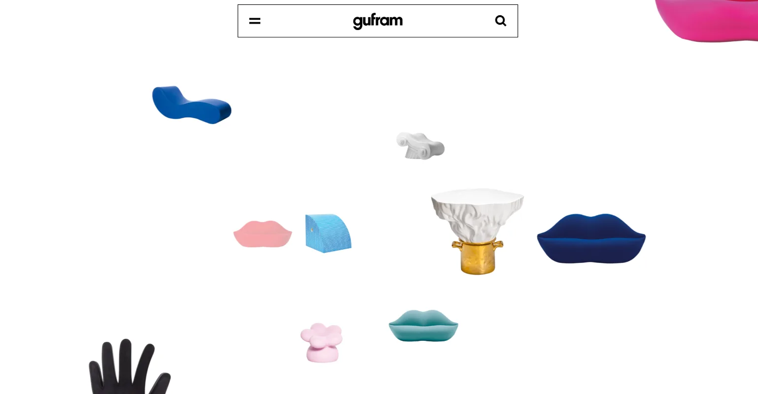
Gufram’s website feels more like a digital gallery than a traditional product site. Bold visuals, playful layouts, and large imagery reflect the brand’s creative personality.
Instead of rigid structure, the site embraces artistic presentation while still keeping navigation clear.
It’s a strong example of how design can mirror the character of the products being showcased.
Our Opinion: Perfect for creative brands looking to showcase their unique personality. We recommend this bold, artistic approach.
5. David Langarica
David Langarica’s portfolio shows how simplicity can be powerful. The site focuses on typography, spacing, and smooth transitions to highlight the work itself.
There’s no clutter competing for attention. Each project feels intentional and easy to explore, which is exactly what a portfolio should do—let the work take the spotlight while the design quietly supports it.
Our Opinion: Ideal for portfolios that want simplicity and elegance. We recommend this minimal approach for creatives.
6. SPINX Digital
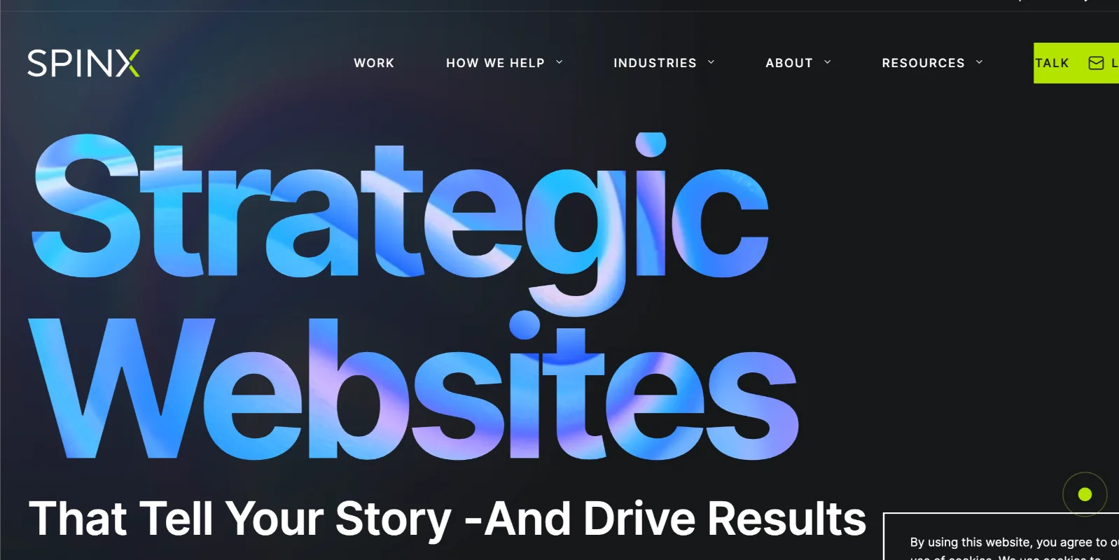
SPINX Digital’s website shows how agencies can combine creativity with clarity. The design uses bold visuals, strong typography, and smooth transitions to guide visitors through its services and work.
Each section flows naturally into the next, making it easy to explore without feeling lost. The site communicates expertise while still keeping the experience engaging and modern.
Our Opinion: A great example for agencies wanting to highlight their expertise in a modern, engaging way.
7. Foundry
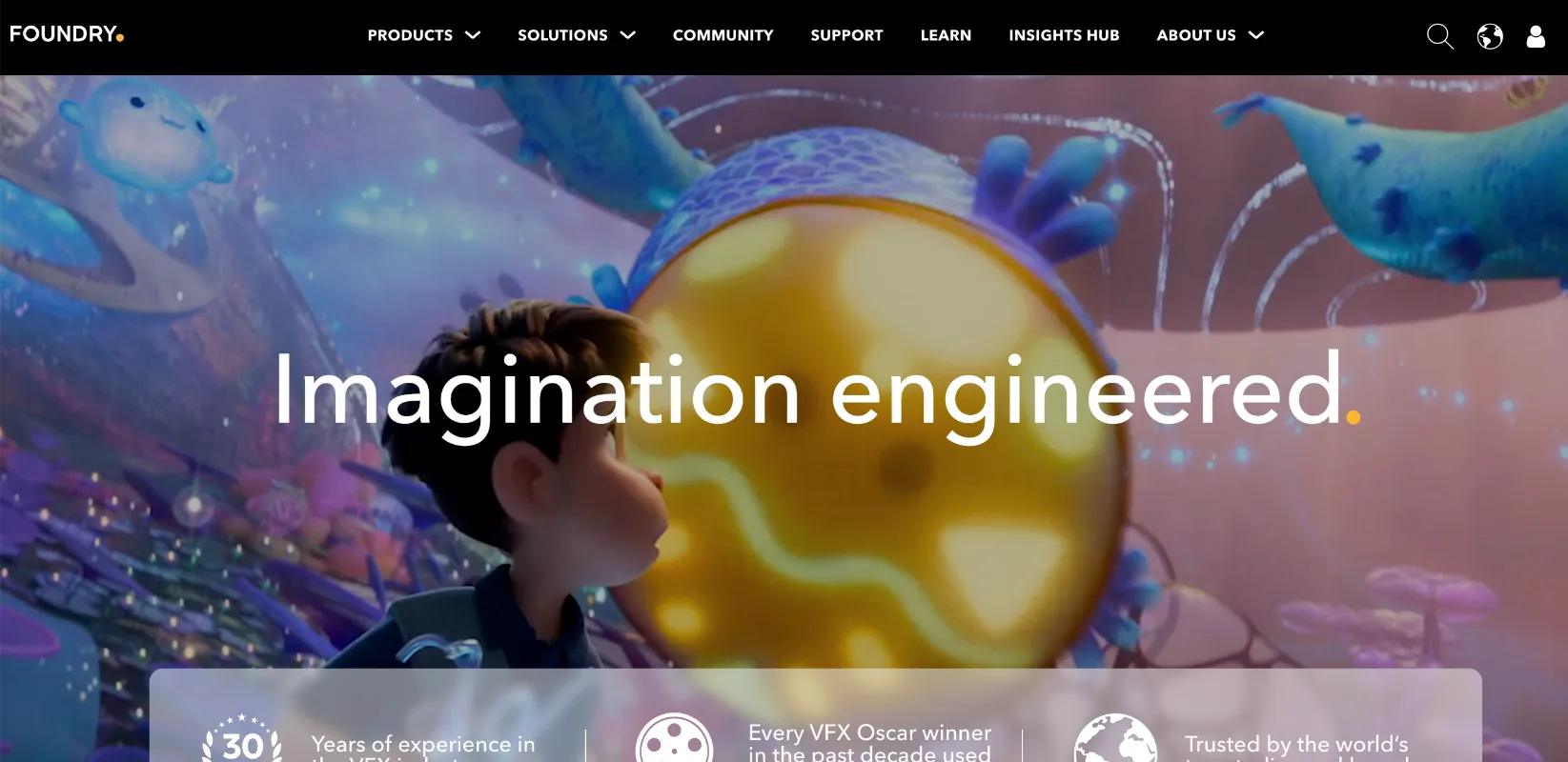
Foundry’s website demonstrates how thoughtful layout and typography can create a refined digital experience. Large headings, balanced spacing, and minimal distractions keep the focus on the message.
The structure feels intentional—every section has room to breathe, making the content easier to scan and understand. It’s a reminder that strong design often comes from restraint rather than excess.
Our Opinion: A refined design that uses thoughtful typography and layout to create a smooth, focused experience. We recommend this for clients wanting clarity and sophistication without excess.
8. Wavespace
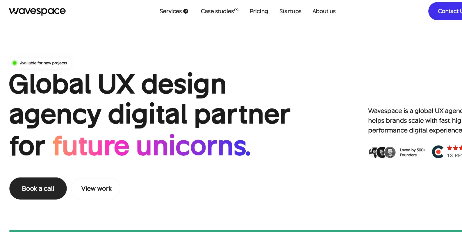
Wavespace leans into modern web design with fluid interactions and a clean visual rhythm. Subtle animations and smooth scrolling create a sense of movement that keeps users engaged without overwhelming them.
The design feels lightweight and immersive at the same time, showing how thoughtful motion and spacing can transform a simple layout into an engaging browsing experience.
Our Opinion: A lightweight, immersive design with fluid interactions that keep users engaged. Ideal for modern, dynamic websites that want to combine simplicity and movement.
9. Awwwards
Awwwards is built as a showcase of the internet’s most creative websites, so the design itself reflects that same standard. The layout is structured but visually rich, allowing users to browse award-winning projects, explore categories, and discover new designers easily.
What stands out is how the site balances inspiration with usability—despite featuring complex designs, navigation stays simple and intuitive.
Our Opinion: A visually rich design that showcases creativity while keeping navigation intuitive. Perfect for websites that want to inspire while maintaining user-friendliness.
10. Lusion
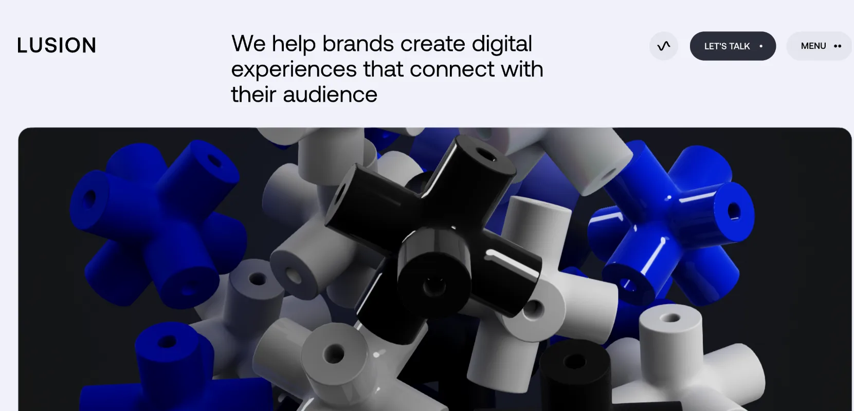
Lusion pushes the boundaries of what a website can feel like. Instead of static pages, the site creates an immersive digital experience through advanced animations, smooth transitions, and interactive visuals.
The storytelling unfolds as users scroll, almost like exploring a digital art installation. It’s a strong example of how modern web technologies can transform a website into something memorable.
Our Opinion: : An immersive, boundary-pushing design that uses advanced animations and interactive visuals. A great choice for cutting-edge, interactive websites that want to stand out.
11. Noomo Agency
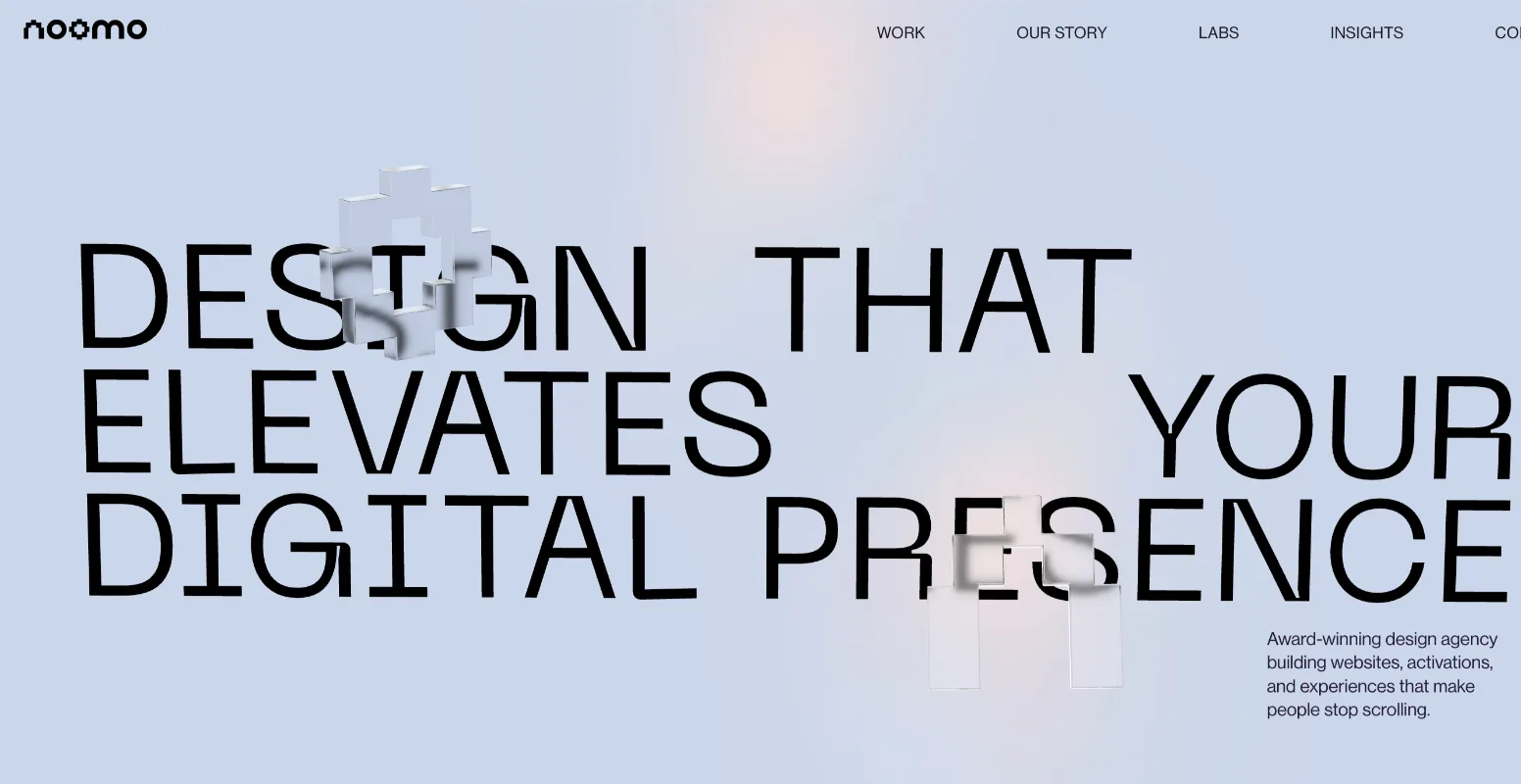
Noomo Agency’s website combines bold branding with a clean, confident layout. Strong typography, vibrant colors, and well-structured sections make the agency’s work and services easy to explore.
The design feels modern but approachable, showing how creative studios can express personality while still keeping the user journey clear and focused.
Our Opinion: Bold branding with a clean layout that balances creativity and clarity. Ideal for creative studios that want to express personality while keeping navigation clear.
12. ClickUp
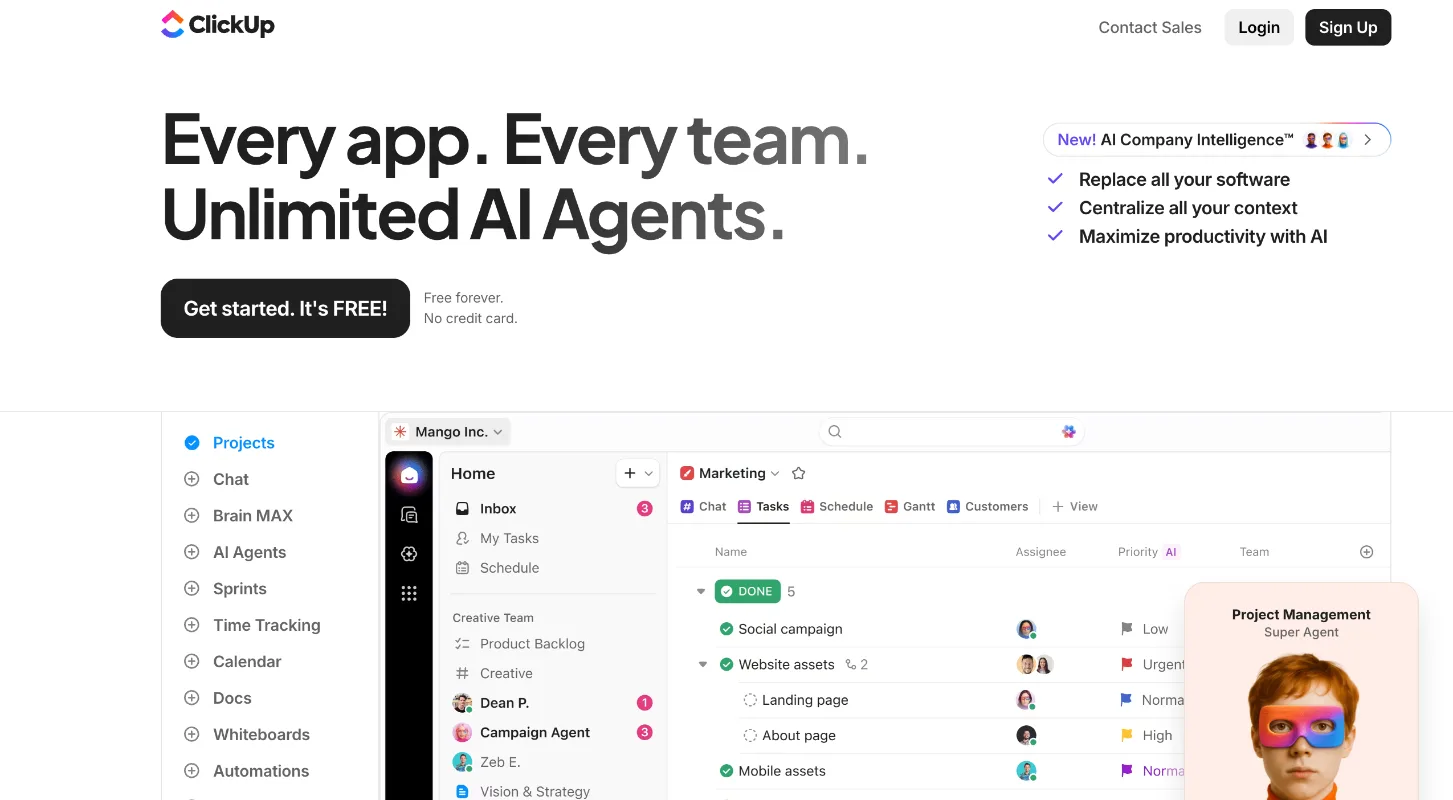
ClickUp’s website is a strong example of how SaaS companies explain complex products clearly. Instead of overwhelming visitors with features, the design breaks information into simple, structured sections.
Bright visuals, product screenshots, and short explanations help users quickly understand what the platform does.
The layout keeps moving the reader forward—showing benefits, building trust, and guiding them naturally toward trying the product.
Our Opinion: Simple, structured design that breaks down complex information clearly. Recommended for SaaS platforms that need to communicate value without overwhelming users.
13. Spotify Design
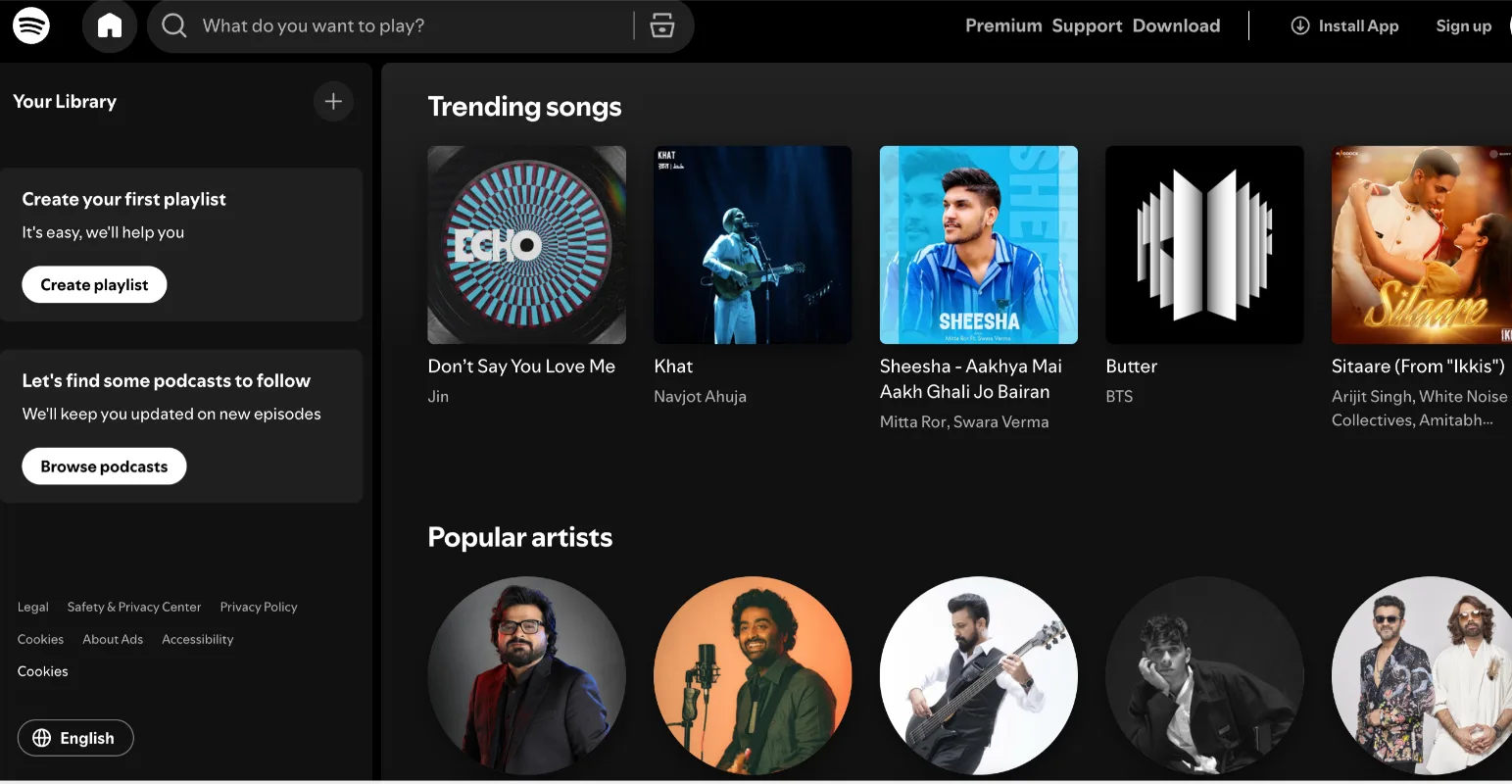
Spotify Design reflects the creative energy behind the brand. The site uses bold typography, vibrant colors, and dynamic layouts that feel expressive and modern.
Rather than presenting information in a rigid structure, the design flows more like a creative showcase—highlighting projects, stories, and ideas from Spotify’s design team.
It’s a great example of how a brand can turn its design culture into a digital experience.
Our Opinion: Bold, expressive design that highlights projects and stories. A strong choice for brands that want to showcase their design culture and engage visitors.
14. B-Egg Farm
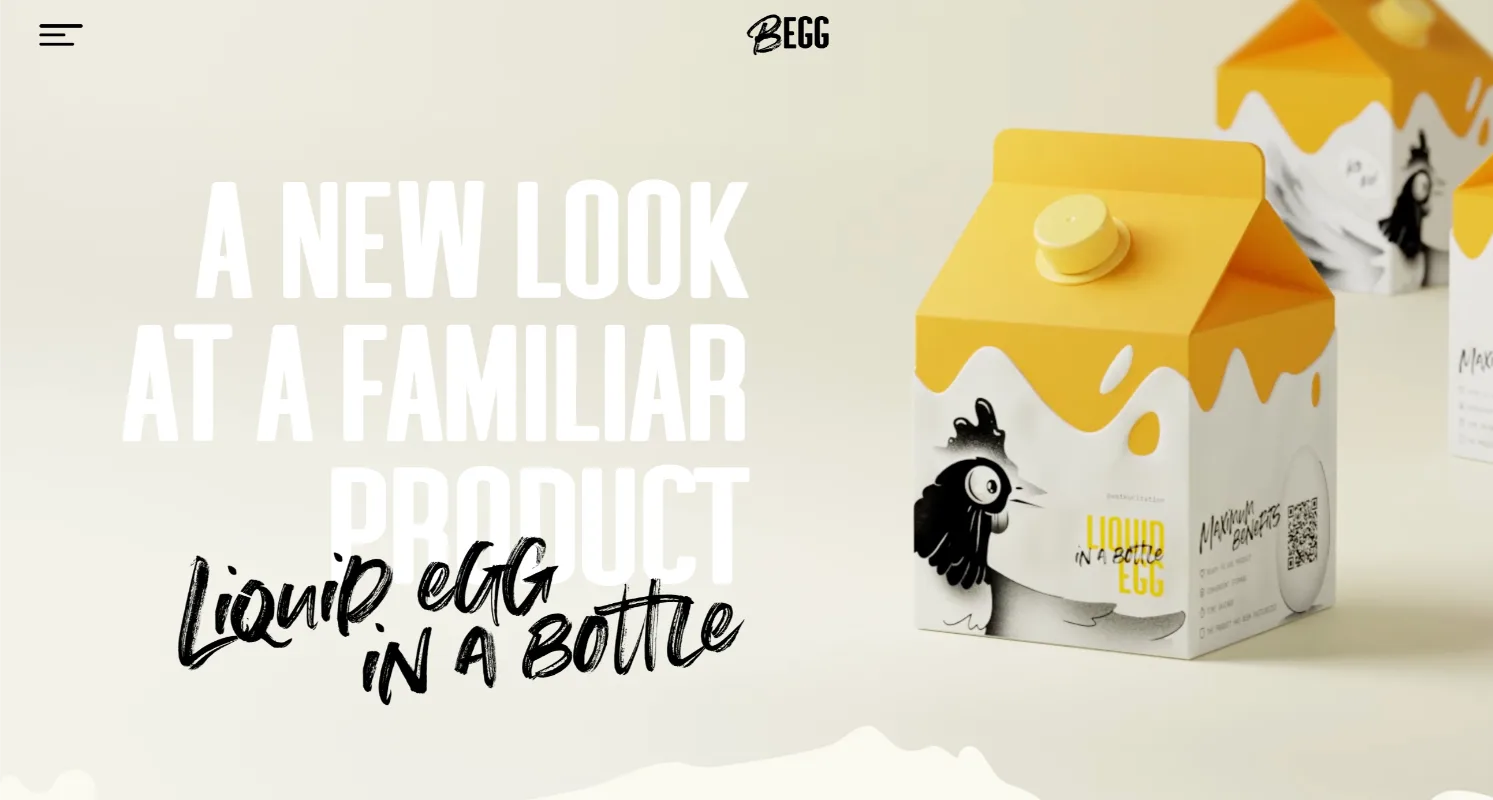
B-Egg Farm takes a playful approach that immediately makes the site memorable. The design uses bright illustrations, creative layouts, and unexpected interactions to tell the brand’s story. Instead of feeling like a typical product website, it feels almost like an interactive journey.
That personality makes the brand stand out while keeping the browsing experience fun and engaging.
Our Opinion: Fun and interactive design that tells a story through playful visuals. Perfect for brands looking to make a memorable impression with a creative approach.
15 . Apple Siri
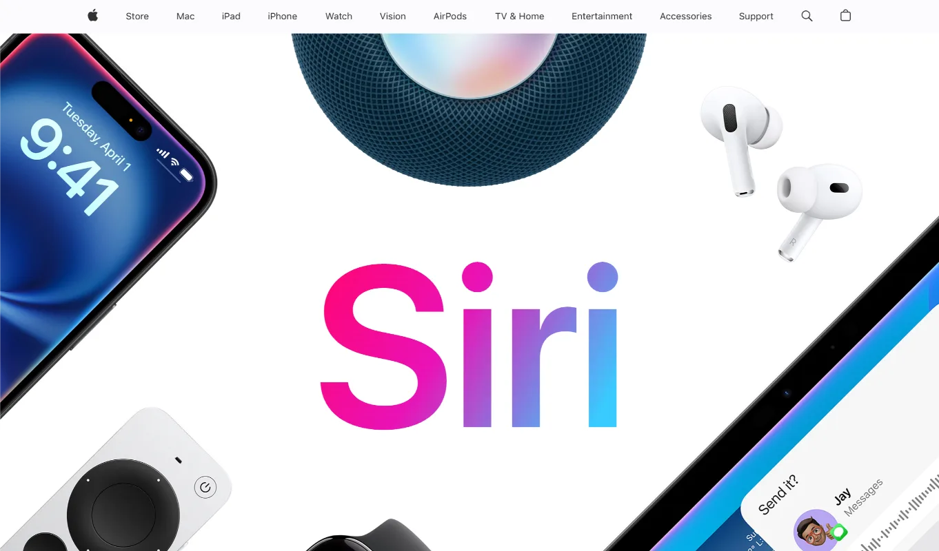
Apple’s Siri pages reflect the company’s signature approach to design—simple, focused, and intentional. The layout relies on clean visuals, generous spacing, and clear messaging to explain how Siri works across Apple devices. Instead of crowding the page with information, the design lets each section highlight one idea at a time.
Smooth transitions and subtle animations add polish while keeping the experience effortless. It’s a reminder that strong design doesn’t need to be loud—clarity and precision often make the biggest impact.
Our Opinion: Clean, intentional design with smooth transitions and clear messaging. Ideal for brands that value simplicity and precision, letting the product speak for itself.
Common Design Elements These Websites Do Well
When you study great websites closely, you notice something interesting: they're rarely complicated. The best ones remove friction, highlight what matters, and guide visitors naturally.
The examples above, from Apple to Airbnb, succeed because they combine simplicity with intentional design choices.
Minimalist Design and Spacing
Minimalist design works because it removes distractions and lets the important parts of a page stand out. Instead of filling every space, strong websites give content room to breathe. Apple’s product pages show this well, large images, generous spacing, and very little clutter allow the product to take center stage.
A well-executed minimalist layout usually includes:
- a restrained color palette
- consistent spacing and alignment through grid systems
- clear separation between sections
That extra breathing room helps visitors focus quickly and gives the website a polished, premium feel.
Bold Typography and Visual Hierarchy
Typography quietly shapes how people move through a page. Strong headlines grab attention first, subheadings guide the reader through sections, and body text fills in the details.
Airbnb’s website illustrates this approach well. Large, confident headlines paired with clean, readable fonts make the content easy to scan. Visitors can understand the key message almost immediately without reading every word.
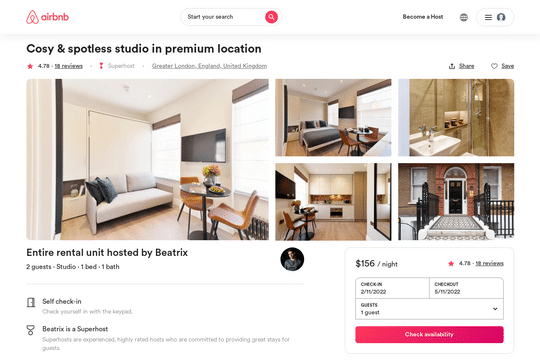
Good typography does more than improve readability, it reinforces the brand’s personality and naturally directs the user’s journey across the page.
Smooth Scrolling and Micro-Interactions
Thoughtful interactions can turn a static website into something that feels alive. Subtle hover effects, gentle content reveals, and smooth transitions help users feel that the interface responds to them.
The key is balance. Motion should guide attention, not compete with the content. When used carefully, micro-interactions provide feedback, highlight important actions, and make navigation feel effortless.
Strong Brand Storytelling
The most effective websites don’t simply list features; they tell a clear story. From the first screen, visitors should quickly understand what the product is, who it’s designed for, and why it matters.
This often begins with a strong hero section and continues as the page unfolds, through visuals, examples, and proof points that reinforce the message. Instead of overwhelming visitors with information, the site gradually builds understanding.
When design, messaging, and structure work together, the website feels cohesive rather than fragmented. It stops feeling like a collection of pages and starts feeling like a carefully guided experience.
Summing Up
When you look through these examples, one thing becomes obvious: the best websites don’t just look modern, they make things easier for the people using them.
A clean layout, thoughtful typography, and smooth interactions all work together to guide visitors without confusion.
What I always notice in strong website designs is how simple everything feels. The message is clear, the navigation is easy, and the visuals support the story rather than compete with it.
That balance between creativity and clarity is what turns a website from “good looking” into genuinely effective.
For us at Devflow, this is exactly how we approach web design. A website should help people understand your product, trust your brand, and take action without friction.
When the structure, content, and design align, the experience feels natural, and that’s when a website truly starts working for your business.